Improving Canada’s Access to Mental Health & Substance Use Support

Project summary
Client
Health Canada
Domain
Public Sector • Government of Canada
Timeline
9 Weeks
My Role
UX Research & Analysis
Who is Health Canada?
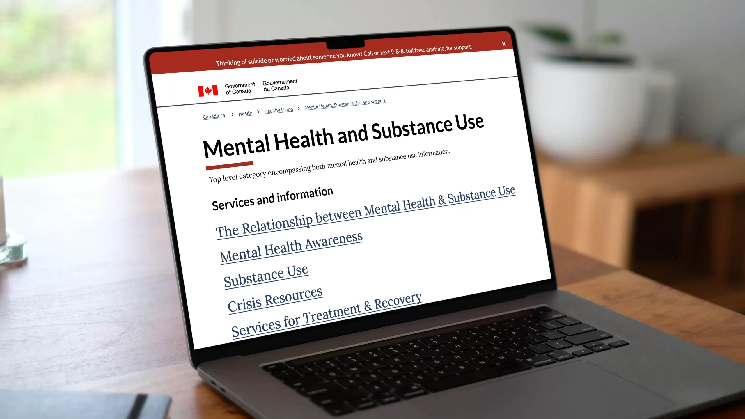
Health Canada is the federal department responsible for promoting and protecting the health of people living in Canada. It provides trusted resources, programs, and policies, including essential support for mental health and substance use challenges.
What was the goal of this project?
The goal of the project was to conduct a multi-faceted research approach to evaluate existing content, identify gaps, and better understand real user needs. This research provided evidence-based insights to help Health Canada deliver clearer, more accessible, and effective mental health and substance use support resources.
What was my role?
As the UX research lead, I was responsible for planning, guiding, and executing the research approach and process for the project. This included developing research strategies, creating trauma-informed research materials, facilitating interviews and usability tests, and synthesizing insights into actionable recommendations. I also supported the research team by ensuring they were equipped to handle sensitive conversations with care and empathy.
Main challenges
While this project presented challenges, we met them with thoughtful strategies and collaboration. The main challenges we faced were:

Sensitive Subject Matter
Exploring the topics of mental health and substance use required empathy, as the topic could impact both participants and the researchers involved.

Recruitment Challenges
Stigma around the topics of mental health and substance use made it difficult to find participants open to sharing their experiences in detail.

Tight Deadlines & Expansive Scope
We had just 9 weeks to review and address a large portion of a government website, covering two complex topics with extensive resources and content.
Research methodology
We used a mixed-method approach, reviewing existing content and practices from similar organizations, supported by diverse participant feedback. Each phase delivered detailed reports with actionable insights for potential redesign.
Heuristic Analysis
We conducted an expert review of the “Mental Health and Wellness” and “Substance Use” sections of the Health Canada website using Nielsen Norman Group’s 10 heuristic principles. Three UX researchers independently scored the content from ‘zero’ (critical issue) to ‘four’ (no issue), identifying key usability challenges and forming hypotheses to guide further research.
Comparative Analysis
We reviewed five websites from public and private sectors to explore how similar platforms address users’ needs. We looked at:
- BC Mental Health & Substance Use Services (BCMHSUS),
- Wellness Together Canada,
- Centre for Addiction and Mental Health (CAMH),
- Australia’s Department of Health and Aged Care, and
- Substance Abuse and Mental Health Services Administration (SAMHSA).
This helped identify successful patterns and areas for improvement.
Website Analytics
We analyzed the Jan–Dec 2023 Adobe website analytics report for the Mental Health and Substance Use sections of the Health Canada website. This provided insights into user behavior, navigation patterns, and engagement trends.
User Surveys
We thoughtfully designed a survey and hosted it on the Health Canada website to collect quantitative data on user needs, preferences, and pain points. This also helped in recruitment efforts for usability testing exercises that followed.
Baseline Usability Testing
Participants recruited from the survey and the Jumping Elephants participant pool, contributed to usability tests. The goal was to understand audience needs, assess existing content strengths and weaknesses, and establish a usability benchmark for proposed improvements.
Information Architecture & Treejack Testing
We reworked the site’s Information Architecture (IA) based on insights from earlier research, collaboratively developing a revised IA with the client team. To validate the structure, we conducted Treejack testing using the ‘Optimal Workshop‘ tool with real participants, measuring how well the IA aligned with user expectations and identifying areas for label improvements.
Rapid Prototyping
A polished version of the IA was rapidly prototyped in Figma, following the GC (Government of Canada) Design Systems, to meet tight project deadlines.
Validation Usability Testing
We conducted a final round of usability tests comparing the revised design against the live (baseline) version. This validated the impact of the research-informed changes and led to a final iteration of the IA.
Key findings
Our research revealed critical insights that highlighted barriers users faced when navigating the Health Canada website. These include, but were not limited to:

Overwhelming Content Volume
Participants felt lost due to the sheer amount of information presented without clear prioritization.

Difficulty in Resource Discovery
Important resources and helplines were hard to find, especially when seeking scenario-specific information.

Navigation Barriers
Participants struggled to retrace steps and found the site difficult to explore due to vague headings, overlapping topics, and inconsistent labels.

Trust in Government Sources
Participants generally trusted Health Canada but often sought additional validation through personal connections like family, professionals, or peer groups.

Unfamiliar Language
Technical terms and unfamiliar keywords made it harder for users to comprehend and locate relevant content.

Challenging Mobile Experience
Complex tables and content structures were genrally harder to navigate on smaller screens.
Proposed solutions
To address these challenges, we proposed the following key solutions focused on improving clarity, accessibility, and support for diverse user needs.
Content Prioritization & Categorization
-
-
- Implement clear prioritization of information based on user needs and frequency of use.
-
- Categorize content into distinct sections with clear hierarchies to guide users effectively.
-
Enhanced Search and Navigation
-
-
- Implement a robust guided search feature with specific prompts to help users navigate to relevant resources easily.
-
- Incorporate comprehensive filters for refining search results based on user preferences such as location and resource type.
-
Improved Information Architecture (IA)
-
-
- Revised IA to streamline navigation paths and ensure consistent labeling and categorization across the site.
-
- Simplify labels and eliminate overlapping topics to enhance clarity and intuitive navigation.
-
Plain Language Implementation
-
-
- Reduce use of technical jargon and complex technical terms where possible.
-
- Use plain language throughout the content to improve comprehension and accessibility for all users.
-
Improved Transparency
-
-
- Enhance transparency by clearly indicating the sources of information. Provide validation cues and links to authoritative sources where applicable.
-
- Foster trust through consistent, reliable content updates and user feedback mechanisms.
-
Mobile First Approach
-
-
- Adopt a mobile-first approach to ensure seamless usability across all devices.
-
- Optimize content layouts, particularly complex tables and structures, for smaller screens. Incorporate responsive design principles and minimize scrolling for a more intuitive mobile experience.
-
Conclusion
Our research confirmed that the relationship between Mental Health and Substance Use is complex and deeply interconnected. We learnt that either or both can emerge independently from shared risk factors, or they can become linked when one influences the other. Some of the main impacts of our research include:

Stakeholder Appreciation
Stakeholders recognized the team’s commitment and the quality of insights delivered, highlighting the depth of findings despite a compressed timeline.

Diverse User Insights
Engaging with a broad range of participants offered a deeper understanding of user needs. Benchmarking against global institutions also provided stakeholders a clearer view of best practices.

Actionable Recommendations
We delivered targeted recommendations, including a revised information architecture that better connected mental health and substance use content.
Personal takeaways
Mental health and Substance use are topics I deeply care about and want to raise more awareness around. Being part of this project felt meaningful… It was a chance to learn, grow, and contribute to something that could make a real difference.
I leaned on empathy not just for participants and end users, but also for myself and my team, recognizing the emotional weight of the subject matter. This experience reminded me why I love working in UX. What a privilege to be able to dig into complex challenges, listen to real voices, and create solutions that have genuine impact.
-Fin-
Up next


