Designing an Accessible Mobile App for Personalized On-Demand Care

Project summary
Client
Whimble
Domain
Private Sector • Healthcare
Timeline
7 Weeks
My Role
UX Research & Analysis
Who is Whimble?
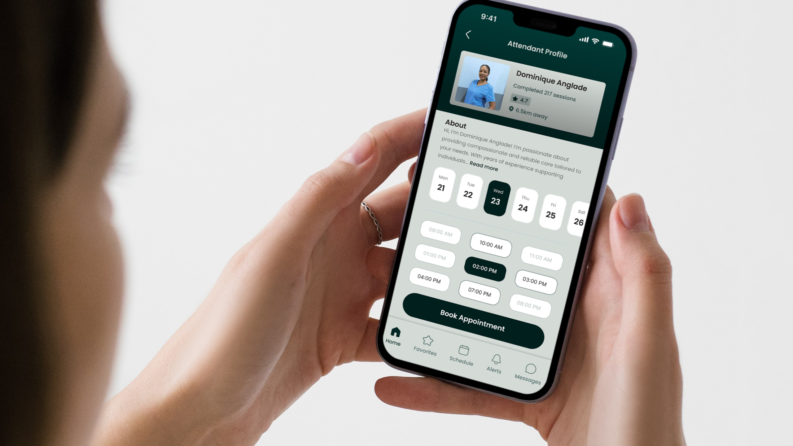
Whimble connects people with disabilities to on-demand care, ensuring they can access the support they need when unexpected situations arise. Their community-driven platform empowers clients and caregivers to connect seamlessly, prioritizing dignity, trust, and humor in personal care.
What was the goal of this project?
Whimble was managing on-demand support using a mix of tools like their website, calls, texts, and Slack. The project aimed to test and refine a proof of concept for their new mobile app, ensuring it was accessible for both clients with disabilities and caregivers. The goal was to evaluate functionality, identify areas for improvement, and enhance navigation, task completion, and service coordination.
What was my role?
As the UX Research Lead, I conducted accessibility-informed usability testing under tight deadlines to support the development of a reliable, user-friendly platform. My responsibilities included developing research strategies, creating inclusive testing materials, facilitating sessions, and synthesizing findings into actionable recommendations. I also ensured the research team was prepared to engage with participants sensitively and empathetically.
Project summary
While the project presented unique challenges, we collaborated closely with the client to navigate them effectively:

Tight Timeline
We had just 7 weeks to run this fast-paced project, so we had to focus on getting the most value from limited time.

Engaging a Vulnerable Population
We worked with participants in sensitive situations, so creating a safe, respectful, and empathetic space was essential.

Limited and Diverse User Base
As a newer service, we had a small but diverse group of participants, so we had to be thoughtful about balancing representation.
Research methodology
Our approach centered on usability testing while incorporating additional activities to ensure a comprehensive evaluation. Each phase was followed by detailed reports with actionable insights, guiding the development of a more accessible app design.
Prototype Review
We conducted a thorough expert review of Whimble’s initial wireframes to understand the app’s features, services, and overall vision. This evaluation, based on Nielsen Norman Group’s 10 heuristic principles, helped identify usability gaps and refine the prototype before testing.
Task Development
A task development workshop was held to design realistic testing scenarios reflecting actual app usage for both clients and caregivers. This process involved collaborating with subject matter experts to define high-priority tasks tailored to the app’s core user groups: the supply side (caregivers) and the demand side (clients with disabilities).
Participant Recruitment
We recruited participants from two distinct user groups for usability testing:
-
- Demand Side: People with disabilities, including physical, vision, hearing, and speech-language impairments
- Supply Side: Caregivers and attendants providing services to the demand side
Recruitment involved developing inclusive outreach materials and engaging with both Whimble’s database and Jumping Elephants’ participant pool.
Preparing Test Guides & Ensuring Accessibility
We developed separate test guides for each user group, prioritizing accessibility. The guides were designed to accommodate tools like screen readers and text-to-voice technology. Additionally, we reached out to participants with disabilities to identify and address any specific accessibility needs.
Baseline Usability Testing
Baseline usability tests were conducted to assess the app’s current strengths and weaknesses, understand user needs, and set a benchmark for future improvements. Both user groups participated to evaluate the initial prototype and identify key areas for refinement.
Validation Usability Testing
Following the baseline round, we tested an updated prototype to compare its performance with the original version. This validation round measured the impact of research-based design changes and further refined the app’s usability.
Key findings
Overall, participants appreciated the concept of the Whimble app but identified key areas for improvement, particularly around navigation, accessibility, and added features.

Overwhelming Registration Process
Participants found the registration pages lengthy and text-heavy, making them feel overwhelmed.

Small Font Size and Touch Points
Many participants struggled with reading the small font size and interacting with small touch points.
Confusing Icons
Certain icons, especially in the navbar, were unclear, leaving participants unsure about their purpose.

Limited Personalization
Demand-side users desired features like auto-filled profiles, care sheet uploads, and session reminders.

Enhanced Caregiver Features
Supply-side users requested options like setting maximum travel distances and automated reminders for scheduled requests.
Key findings
We carefully analyzed participant feedback and developed targeted recommendations to address key usability challenges. These solutions aimed to simplify the user experience, improve accessibility, and enhance functionality for both user groups.
Simplify Registration Process
To make the registration process less overwhelming, we proposed breaking down long paragraphs and presenting content in a step-by-step format for better readability and comprehension.
-
- Divide information into smaller, digestible sections.
- Use clear headers and progress indicators to guide users.
- Minimize the amount of text shown at once.
Improve Font & Touchpoint Accessibility
We recommended adjusting font sizes and touchpoint dimensions to ensure comfortable interaction for all users, enhancing overall accessibility.
-
- Increase font size across the app to improve readability.
- Expand touchpoints to accommodate users with mobility challenges.
- Test adjustments with assistive technology for optimal performance.
Clarify Icons and Navigation
To reduce confusion, we suggested labeling all icons with text and avoiding reliance on color alone to convey information.
-
- Add text labels to navbar icons and key interactive elements.
- Use consistent iconography aligned with user expectations.
- Pair color-coded elements with text or symbols for clarity.
Enhance Personalization for Demand-Side
To address user needs, we recommended adding features that streamline interactions and provide tailored options.
-
- Enable auto-filled profiles and care sheet uploads.
- Add session reminders, invoice notifications, and attendant preferences.
- Develop a search feature to request specific attendants.
Expand Caregiver Features for Supply-Side
We proposed new features to better support caregivers, ensuring their preferences and schedules are accommodated.
-
- Allow caregivers to set maximum travel distances.
- Add automated reminders for upcoming requests via app or text.
- Offer schedule optimization tools for managing multiple requests.
Conclusion
This project delivered impactful results by addressing user pain points and improving the app’s usability and accessibility. The changes ensured a more inclusive, user-friendly experience for both clients and caregivers.

Improved Task Success
Design changes led to higher task success rates and improved efficiency during testing, showing clear usability enhancements.

Inclusive Proof of Concept
Delivered a prototype app that followed accessibility standards and set a strong foundation for inclusive services.

Positive Participant Feedback
Participants found the app intuitive and easy to use, with comments like, “It is very straightforward,” and “Really, really cool, user-friendly, and customizable.”
Personal takeaways


